Mapping the Speed of Surface Transit
Many factors influence the average speed of street-running transit. Generally speaking, the density of stops and the many environmental “obstacles” determine how fast a transit vehicle will cover its route [1,2]. Contingent factors that vary throughout the day, such as the level of traffic and the number of passengers boarding and alighting, influence performance too [3,4]. Because of the variety of urban environments, there is no typical street-running urban transit route or typical average speed. Bus and tramway routes can be as slow as less than 8 km/h (~5 mph) or well above 30 km/h (~18.5 mph) on average. The same bus route can have faster stretches, for example, when it runs through peripheral areas characterized by low traffic and widely spaced stops, and slower segments, often within and around the city center. Urban routes are slower than suburban ones, which are slower than interurban and rural ones.
The average street-running transit speed varies geographically across a metro area and temporally throughout the day and the week, at both the system and route levels. There can be seasonal variability as well. The following analysis of the variation in surface transit speed across trips, geography, and time of day, based on a sample of 32 cities in North America, Europe, and Oceania, uses weekday static GTFS feeds, that is, scheduled running times. To learn more about the methodology, click here.
The distribution of speed across trips
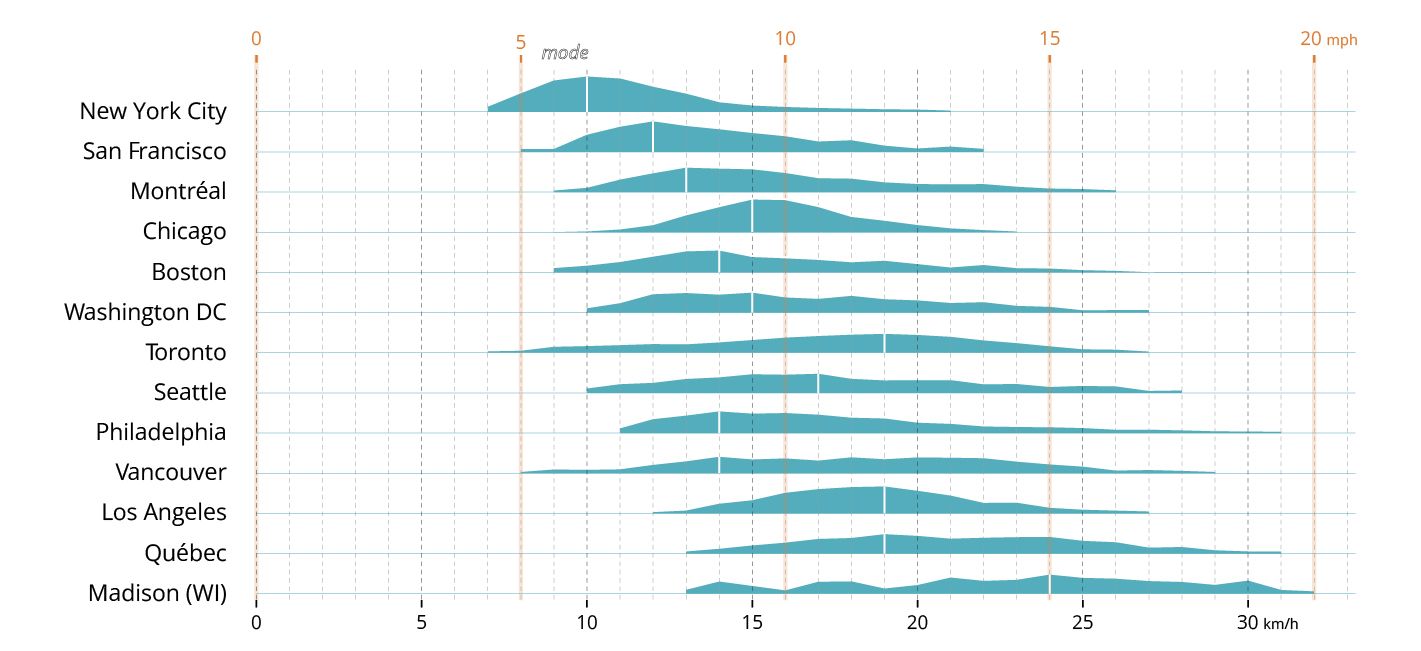
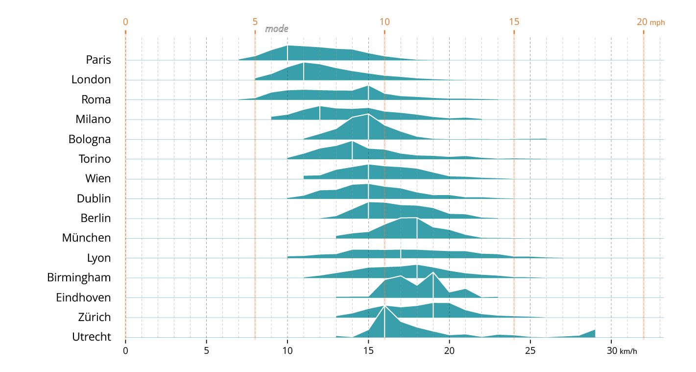
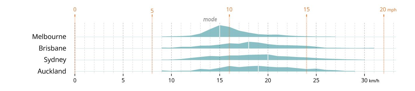
This graphic depicts the distribution of planned speeds for individual urban transit trips on a typical weekday across a sample of cities in Europe, North America, and Oceania. The speed distribution generally follows a bell-shaped curve around the median, but each city exhibits a distinct profile. Unsurprisingly, larger metropolitan areas have a lower average speed. Some cities have lower median speeds and a compact distribution within a narrower interval. Others have long tails and a “flatter” curve, indicating a wider range of speeds resulting from greater variability in urban environments and greater variation throughout the day.
North American metro areas outside New York City and Chicago are characterized by sprawling suburbs and relatively small prewar cores, which explains the flatter curves with longer tails. Small North American metro areas such as Madison, WI, and Québec, QC, characterized by small older cores and extensive postwar suburbs, exhibit long tails and higher average speeds.
European cities tend to have a more compact distribution of trip speeds, suggesting a more uniform urban environment with less variation throughout the day. However, there are nuances and exceptions. Utrecht, characterized by a bus service that covers extensive areas of low-rise and satellite developments, displays a long tail, whereas both Birmingham and Lyon exhibit a flatter, longer tail.
In Oceania, Melbourne shows a much more pronounced curve than peer cities, likely due to the weight of its extensive bus and tramway system serving its relatively well-developed prewar streetcar suburbs, while the other cities boast a flatter curve with long tails.
The geographical distribution of speed
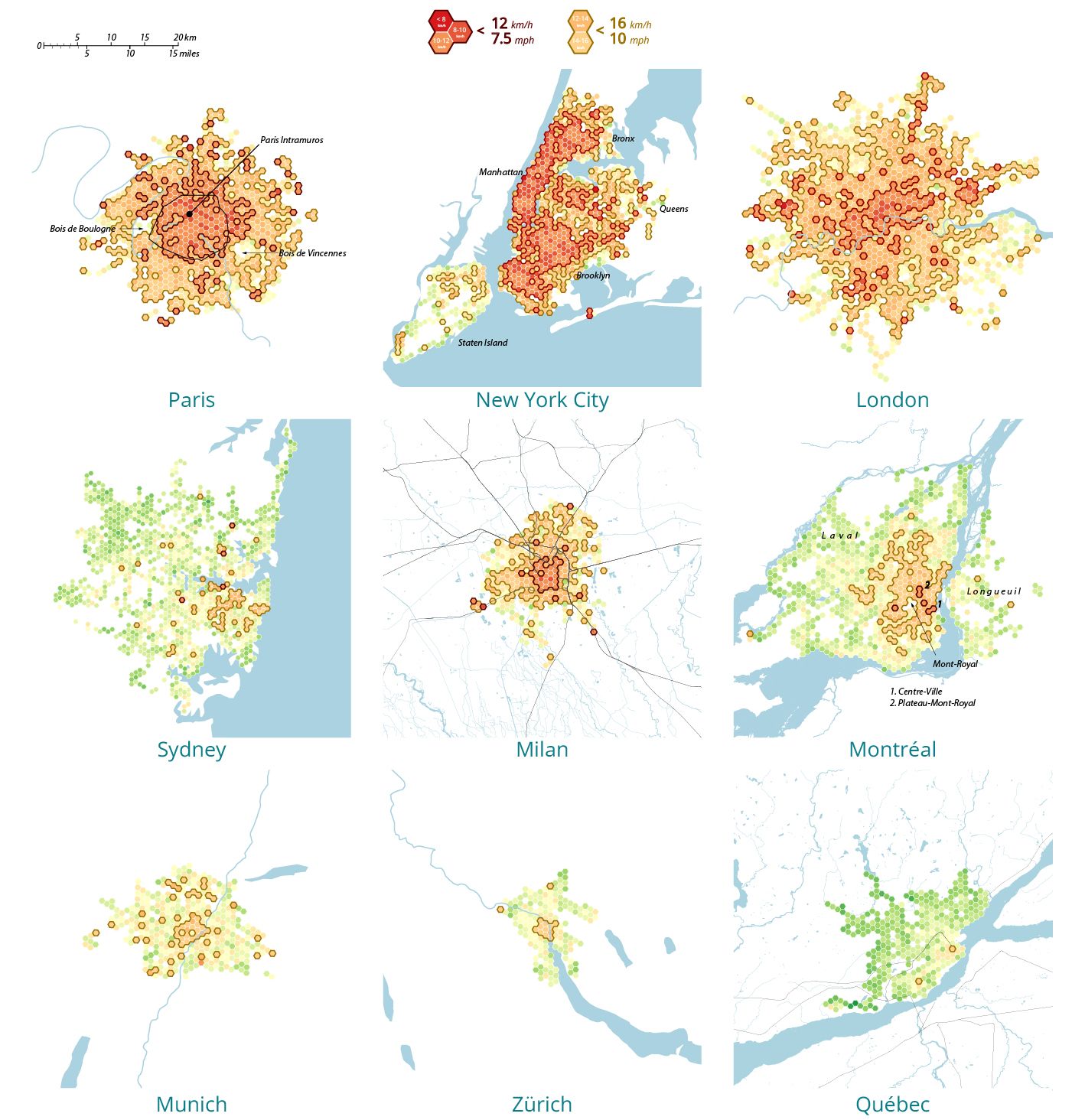
Surface transit speed varies dramatically across a metro area. Most cities are divided between a slower core and a generally faster periphery. Larger metropolises like New York, Paris and London have a vast “slow core”, with most of the metro area showing an average speed of less than 16 km/h (10 mph). They also have a sizeable “very slow core” where buses crawl at less than 12 km/h (7.5 mph). In Paris, this spans most of the intramuros area and northern immediate suburbs. In New York, Manhattan, most of Brooklyn, the Southern Bronx and pockets of Queens. In London, most of the so-called Zone 1 and 2 and several scattered suburban pockets, reflecting the more decentralized nature of the British capital. Cities at the center of medium-sized metro areas, like Montréal, Sydney and Milan, have different speed geographies reflecting their more compact (Milan), mixed (Montréal) or sprawling urbanism (Sydney). Surface transit speed in smaller metro areas like Zurich, Munich and Québec City reflects the divide between New and Old World urbanism.
Select a city
Selected city: New York City
City population: 19.50M
Bus operator: MTA - NYCB
Weekday Mean Speed: 12 km/h
Select a time
The temporal distribution of speed
Surface transit speed varies throughout the day, with a “double dip” profile reflecting speed degradation during the morning and afternoon peak hours separated by a midday plateau. Traffic and longer dwell times are the leading causes of reduced speed during peak hours.
The following graph shows the variation in the scheduled average speed of active trips at half-hourly intervals between 4 a.m. and 11 p.m., both in absolute terms and normalized by the daily mean speed.
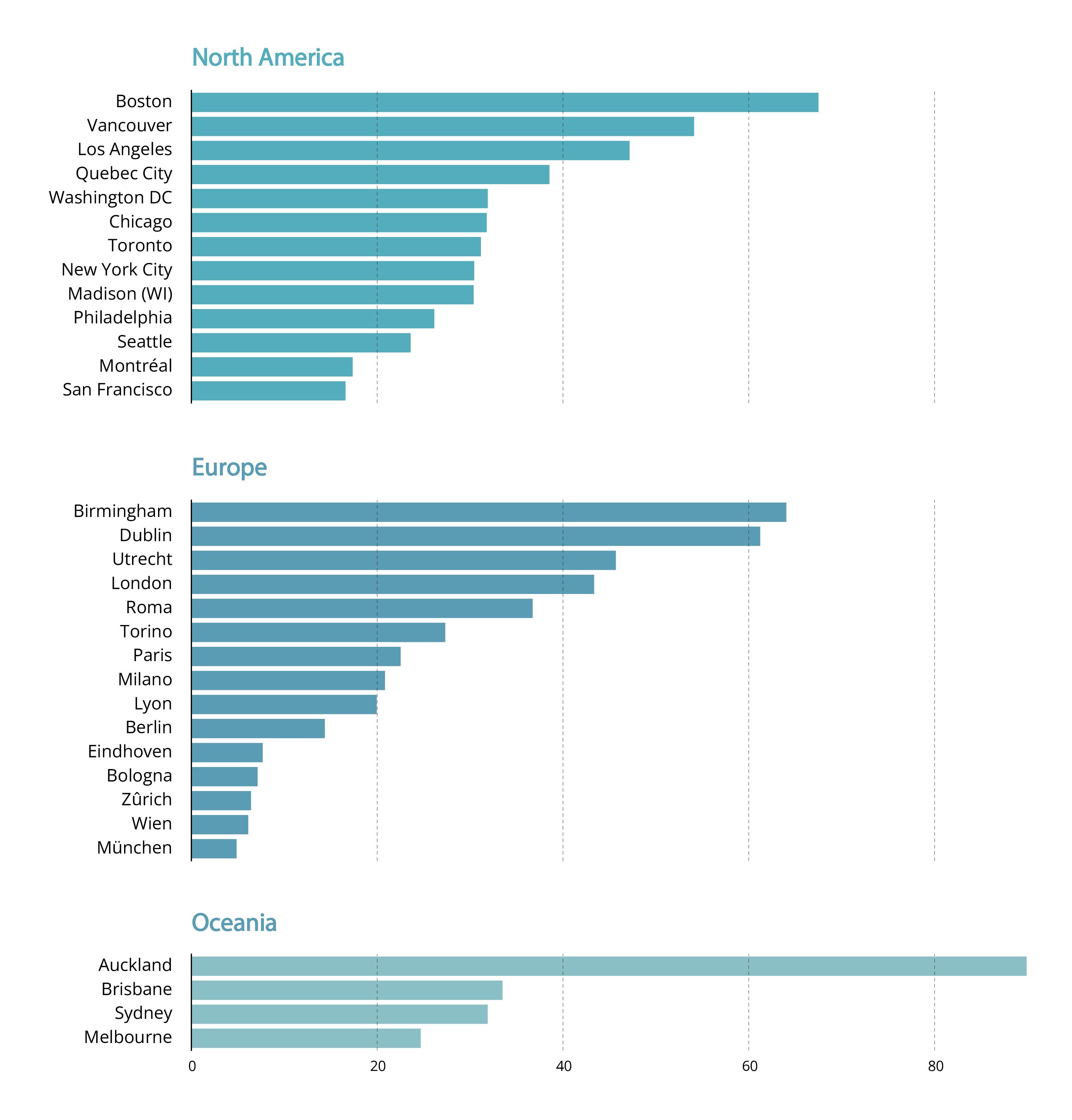
However, the speed variation throughout the day is not as pronounced across all jurisdictions. The following chart illustrates the Median Absolute Deviation (MAD) of the half-hourly rolling average for each city between 7 am and 8 pm. The MAD is a measure of statistical dispersion that indicates how much the half-hourly rolling average deviates from the median for each city. The value is expressed as a percentage of a city’s median speed to control for differences in baseline speeds across cities. This measure is a synthetic indicator of the daily variability of transit running times during the core of a weekday, excluding the early morning and late evening service hours which tend to have much faster service.
Munich, Vienna, Zurich, Bologna, and Eindhoven exhibit the lowest relative MAD, indicating that their scheduled speeds are more consistent throughout the day, suggesting that surface transit in these cities is less affected by recurrent sources of delay, such as longer boarding times and congestion during peak hours. In contrast, cities like Birmingham, Boston, Auckland, and Vancouver exhibit higher MAD values, indicating greater variability in average speed throughout the day and suggesting that their surface transit is more sensitive to factors that cause delays and increase running times (and thus reduce speed) during peak hours.